The economy is tough. Money and resources are scarce. But you just started a new company and/or your existing company needs to create a new business website. When you’re in this situation, it’s extremely tempting to cut costs and go cheap in every aspect possible. Frankly, as an entrepreneur you should always look to cut costs and go cheap – and whenever you’ve analyzed a situation where it makes sense to do so, do it. Over the long run, this type of mentality can end up being an advantage for your business. But there are certain aspects of business we just cannot be stingy with. One of these, without question, is the graphic design (i.e. overall appearance) of your business website. A decision to go cheap here can break your business before it even got started.
Why?
Because IT ALL STARTS WITH DESIGN.
First Impression Could Be The Last Impression
The first impression that people get about the class, quality, credibility, and authority of your business comes from the appearance of your website. I’m not referring to the structure of it, nor all the different pages you have, nor any impressive functionality it displays. Hec, anyone can write some sentences and take some pictures and lob them into a free wordpress blog website. Instead, I’m simply referring to the graphic design quality of your website. Why? Because not everyone can afford to pay for quality graphic design. And if you can afford it, it makes your business look serious, trustworthy, credible, well-financed, and successful. People, without thinking about it, make these snap judgments in a few seconds of visiting your website. And if you’re a startup business with little to no history or established reputation, portraying an image of this nature is huge. It makes you look like the products and services you offer are already proven concepts and are therefore worth buying, when in reality your business is brand new.
The Price You Pay for Poor Design Quality
Now, let’s look at the flipside. We’ve all visited business websites that have made us gasp. We’ve all heard people talk up a big game about their company, only for us to visit their website and be appalled with what we see. The bottom line is that you just can’t fake a good website design. You can’t claim that your company is doing well, when your website looks like no investment has ever been made into it. These days, people can tell if you spent a lot on your design or if all you could afford was a poorly designed cheap template or a free template website. Just how a nicely designed business website can benefit you, a poorly designed one can break you. It has just the opposite effect of what you want. A poor design instantly makes you and your business appear risky, untrustworthy, underfinanced, unprofessional, and unsuccessful (at least thus far – because with success you should be able to afford a nicer website!). So if you make the decision to go cheap on design, you are sure to pay a heavy price.
What Makes Up an Expensive-Looking Design
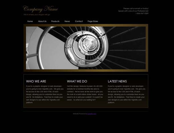
Now that we’ve established that business website design is vitally important, let’s explore what makes up an expensive looking web design. There are certain elements that give people the sense that big bucks we’re shelled out. Animation is a key example. Animated image transitions, animated drop-down menus, etc. appear expensive because they are just that - expensive. Normally they require custom work from a skilled programmer/designer and this can bring your costs into the thousands. Therefore, you typically don’t find elements like these on cheap websites. That’s why some business websites have them, and others don’t. That’s why I’m telling you now these elements are mandatory, not optional. The other obvious design elements are tasteful color coordination, fonts, link colors, image border colors, and spacing. Websites that are not professionally designed make bad use of these elements. For example, there’s an unwritten law in design that you should never use more than 2 font styles on a design. But on a regular basis, we see websites with 4 or 5 fonts being used, and as a result they lack clarity, flow, and cohesiveness, and to the novice eye they just look sloppy. Another common design flaw is with spacing. On a regular basis, we see people trying to cram as much text and images as they can into small spaces and the result is a website that looks cluttered, disorganized, and sometimes chaotic. While these are just a few examples of many, they all contribute to the perception of design gone cheap. And as stated above, design gone cheap leads to the perception of business-gone-cheap or business-have-no-money. Trust me - this is NOT the impression you want to give to potential customers.
Try a Business Website Creator with First-Class Design Quality
IconoSites is a very unique business website creator tool. Unlike other website builders for business, IconoSites incorporates these expensive elements into their web-based software which ultimately gives your business website a high end look and feel. Therefore if you can’t afford a custom designed and programmed website (which can cost anywhere from $3,000-10,000), IconoSites is the perfect solution. It’s not your typical template small business website creator software that you are used to seeing or using, which really struggles in delivering great design quality. Instead, the design quality in IconoSites really is in a league of its own when it comes to business website creators. IconoSites gives you the ability to add animated image transitions, animated drop-down menus, as I previously mentioned and other cool elements that will take your business website quality to the level you need it to be. A level where it impresses and attracts visitors rather than discourages and repels them.